


The prototypes have arrived!
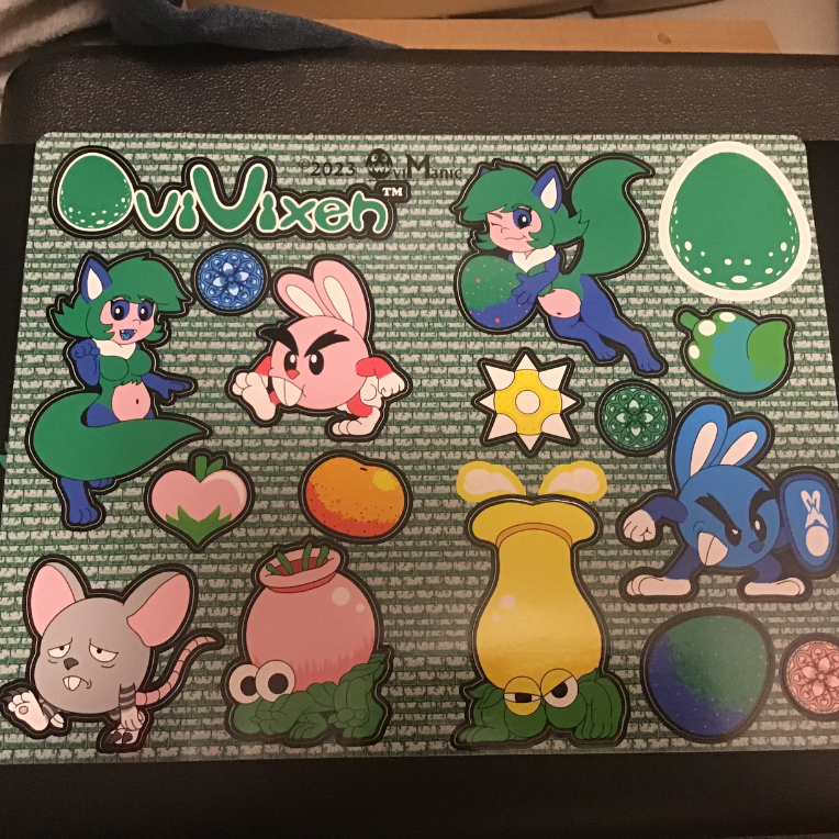
A couple things to note when it comes to these stickers.
- The color quality is excellent despite being bolder than expected
- Despite greens being too similar, there is still some distinction between them
- These stickers are THICK!
- A bit of a struggle to take out, but they’re smooth once they stick onto a smooth surface like my laptop
- Nice gloss!
Some things I need to improve (most of these are already improved in the documents)
- Make the greens brighter and more distinct
Just a little bit of cyans, yellows, and/or whites
- No Dot Matrix
Just changing the hues and saturation of the greens might be enough after looking at the print. No need to compromise the other colors just for the greens to stand out.
- Repositioning
Some edits made by the staff for cut did not translate well between the art and the cut, so I had to make some edits myself to prevent these errors again.
- Change the company logo from black to white
It’s really obscured in print especially with the bolder background
But that’s it! Maybe tonight I’ll send over the final draft to the print guys and request fifty of these before the day of the Yestercade gathering. The guys at print actually send examples of how they’re going to look which I can edit and change before everything is finalized, so that’s a plus!